Stuff that occurs to me

All of my 'how to' posts are tagged here. The most popular posts are about blocking and private accounts on Twitter, also the science communication jobs list. None of the science or medical information I might post to this blog should be taken as medical advice (I'm not medically trained).

Think of this blog as a sort of nursery for my half-baked ideas hence 'stuff that occurs to me'.

Contact: @JoBrodie Email: jo DOT brodie AT gmail DOT com

Science in London: The 2018/19 scientific society talks in London blog post

Sunday, 31 January 2016

Communicating Risk in Health Information (pt 2) - Patient Information Forum event: side effect risks & bowel cancer screening sessions


Last Tuesday I went to PiF (Patient Information Forum)'s event on communicating risk in health information (you can download the presentation slides). It was very good and inspiring and I thought I'd gradually type up my notes.

If you spot any mistakes please let me know, @JoBrodie or my obvious gmail address is somewhere at the top of this blog.

My notes from sessions 1 and 2 are in my previous blog post
Communicating Risk (pt 1) - Patient Information Forum event: health literacy and data visualisation sessions
Session 1: Health risks of low health literacy
Janet Solla, Director, Community Health and Leaning Foundation
Session 2: Using data visualisation to explain risks
Eluned Hughes, Breast Cancer Now

My notes from sessions 3 and 4 below are in this blog post, below
Session 3: Factors influencing the perception of side-effect risk information
Peter Gardner, Head of School of Psychology, University of Leeds

Session 4: Developing a risk communication for bowel cancer screening
Sam Smith, Cancer Research UK Postdoctoral Fellow, Centre for Cancer Prevention, Queen Mary University of London, Wolfson Institute of Preventive Medicine


Tuesday 26th January 2016, 10.30-4pm (with very nice food) at NCVO offices, King's Cross

Session Three - Factors influencing the perception of side-effect risk information
Peter Gardner, Head of School of Psychology, University of Leeds
[slides, PDF]

Peter showed us the patient information leaflet (PIL) for a blood pressure drug which had a long list of fairly unpleasant possible side effects (adverse events) - basically a litany of potential doom and gloom. You could easily imagine that reading this would put people off taking the tablets.

One particular problem is the language used in terms of the relative frequency of these side effects, and what people understand by them.

In testing the official EU terms 'very common', 'common' etc they found that people understood that 'very common' means over 50 per cent whereas in fact it actually refers to 'more than 10 per cent' of people taking the medication. In fact I tested this out later that evening in a group of human-computer interaction experts with whom I was having dinner (on our project which is about making medical devices safer) and they agreed that 'very common' would be more than 50%, as do I (even though I'm fairly familiar with PILs and know what they're referring to).

People actually greatly inflate the risks thanks to the use of these unclear words.

Peter and his team have done a bit of testing via a pop-up on a cancer charity page, which invited website visitors to take part. It was slow going as only around 15 people completed the survey each month so it took ages to get enough to start doing some number crunching. Note that participants were self-selected (visiting that particular website, presumably wanting information and likely to be quite motivated... a large proportion of them also turned out to be educated to degree level)

They tested the effects of stating the risk of side effects as verbal descriptoers, percentages, frequency statements and combinations of these.

For example, "If 100 people take this medicine then 3 would get constipation" (they also looked at 'would' and words like 'will' vs 'may' but there weren't significant differences on that).

Verbal descriptions such as 'common' or 'rare' produced markedly less accurate risk estimations on their own though percentages performed quite well, though less good for things that were lower risk.

People preferred combination statements such as "affects 1 in 500 people (0.2%)" ['affects more than 1 in 10 patients is known as a 'frequency band'].

I wondered, but didn't think to ask, how this information affects people's behaviour if they experience these side effects - do they take them less seriously because they're 'just' a consequence of the medication, so ignore them, or do they monitor themselves for the onset of anything a bit worrying.

Fortunately both NICE (National Institute for Health and Care Excellence) and EMA (European Medicines Agency) are fans of some sort of combination - words and numbers. However this is based more on consensus rather than evidence, because everyone thinks it's a good idea (it probably is but doesn't have a particularly strong evidence base as yet). What is the best combination?


There's certainly a possibility of verbal descriptors having a framing effect on people's understanding but what's particularly clear is that people don't even share understanding of the same risk descriptors. They also want to test with other medications (after all there's also an emotional response to certain types of treatments - you might be pretty relaxed about ibuprofens for muscular pain but much more tense about something that's meant to be keeping your blood pressure normal) and also, partly in light of the presentation earlier on the day about health literacy (session one), they want to test numeracy levels and look at other individual differences. Also to investigate the effect on actual behaviour

See also
Berry DC, Knapp P and Raynor DK (2002) Provision of information about drug side-effects to patients Lancet Mar 9;359 (9309): 853-4


Session Four - Developing a risk communication for bowel cancer screening
Sam Smith @SGSmith_87, Cancer Research UK Postdoctoral Fellow, Centre for Cancer Prevention, Queen Mary University of London, Wolfson Institute of Preventive Medicine
[slides, PDF]

The NHS' Bowel Cancer Screening programme got going in 2008 and involves sending people between 60 and 74 a thing to poo into and presumably send it back. This is so a faecal occult blood test can be done (blood within the poo structure, rather than bleeding). I did wonder when Sam mentioned that this involves putting a small poo sample on card whether people were actually carding their poo at home, but I think not!

This collection is accompanied by a booklet that explains what the test aims to do and what's involved and they wanted to test how well it was understood. One measure of readability is the Flesch-Kincaid measure which looks at sentence and word length and for comparison the Harvard Law Review is about 30, The Sun newspaper is 76 and the NHS Bowel info is 62. 


Interestingly (depressingly) there's a strong correlation between affluence and the returning of a kit - this can mean a danger of introducing inequalities in screening for bowel cancer because only those who return are being screened. Obviously they don't want this to be the 'fault' of the booklet, where people can't understand what's being asked of them and what it all means.

They also did a study where they got people to read the booklet and at various points asked them to 'think aloud' so that they could record people's impressions, and comprehension. In one example someone misunderstood the phrase 'about one in 20 people in the UK will develop bowel cancer in their lifetime' to mean 'that's one in four of the population, isn't it?'. People struggled to get the gist of the facts-based booklet - there were too many facts, some not really that relevant and some text had too much scientific detail.

They also tested the development of an overview booklet (to give people a 'gist' of what's going on). In this document they used more sign posting to help people find their way through it, and also used vernacular language (bowel instead of colorectal). They also called it a 'two minute' guide but someone suggested that that might imply the recommended time to read and might put people off who wanted more info, or felt they'd take longer to read it. They also rejected 'a simple guide' as that might be a bit patronising.

Although their 'gist' leaflet was well understood it arrived with the 'facts' document and the results indicated that the gist leaflet didn't appear to change people's intentions about screening, even if they had more knowledge about it, so no real difference in uptake. One thing they'd like to do is test the gist leaflet as a standalone thing.


Saturday, 30 January 2016

Communicating Risk (pt 1) - Patient Information Forum event: health literacy and data visualisation sessions

Sorry for any typos, written in haste before heading off to see chums so am just getting it up online and will correct any errors later :) This is just my notes from the first two sessions as I'm about to get on a train.


Last Tuesday I went to PiF (Patient Information Forum)'s event on communicating risk in health information (you can download the presentation slides). It was very good and inspiring and I thought I'd type up some of my notes from the first couple of sessions. 

Incidentally I retweeted this picture a year or so ago which I think is interesting, on the use of everyday words and how they can be misunderstood (although jargon words are often incomprehensible they do have the advantage of heralding that you might not understand them, whereas an everyday word might make you falsely believe that you have - in a way plain English might actually cause more problems!). I've written about this elsewhere on this blog.

From a paper about communicating climate change, PhysicsToday 2011

Tuesday 26th January 2016, 10.30-4pm (with very nice food) at NCVO offices, King's Cross

Session One - Janet Solla, Community Health and Learning Foundation
The first session was from CHLF and it touched on a topic I'm particularly interested in - people being able to understand information about health matters, including the language used.
[slides, PDF]

She talked about the sheer numbers of people with very poor basic literacy and abysmal mathematical literacy (numeracy), and how there's less stigma about being vaguely innumerate ("I'm no good with numbers, me") compared with that for being unable to read. Confidence is also an issue - if you're feeling that you know less than everyone else you're perhaps less likely to pluck up the courage to ask and get help.

There was a sad example of someone with a problematic cough whose GP referred him for a hospital X-ray, but on arriving at the hospital he was presented with signs saying Oncology, Paediatrics, Pathology, Radiology, Gynaecology etc but nothing saying 'X-ray'. So he went home and didn't get it done.

People who have lower levels of health literacy may also find it harder to engage with decisions about their healthcare - another example was given of a gardener that might be invited for a knee replacement operation in summer (when it would be better for them to have this non-urgent surgery and the recovery period in winter as summer's a busier time).

Similarly it's usually the well-engaged and literate (or health-literate) who get involved in consultations about service changes, so there's poorer representation of people who aren't generic middle class.

She also gave an example of a patient who was told that his blood test was positive and who took this to mean that all was well so was baffled when the doctor began talking about treatments. A woman receiving chemotherapy infused into one arm (which happened to be the same side as the breast cancer for which she was having the treatment) became distressed when the infusion site was switched to the opposite arm - worried that the drugs wouldn't get across to the other side.

This also made me realise how difficult it is for someone who is super-literate to imagine the many ways in which their kindly interventions might fail, and how things might be misunderstood. Training and awareness may be needed.

I thought of the recent news story that medical student applications tend to come from the most privileged pool of people and risks future healthcare teams that aren't representative of a lot of the people they're serving. The speaker, who does run training and awareness sessions for healthcare professionals about health literacy, pointed out an example of a doctor who'd felt that 'dumbing down' information for people was patronising (no, making that information accessible to more people is a good thing, it can be made clearer, not dumbing down) but sadly another thought that if people weren't prepared to learn to read etc then it was their own fault. This is a worrying attitude.

Even those of us who are plentifully literate might be marinated in fear when we find we're in a hospital being given bad news. It's easy to forget important information if you don't write it down (or are unable to, or didn't have the planning ability to remember to bring pen and paper).

Session Two - Eluned Hughes, Breast Cancer Now (formed from merger of Breakthrough Breast Cancer and Breast Cancer Campaign)
[slides, PDF]

This was a great session on using data visualisation to explain risks, particularly related to the risks and benefits of breast cancer screening for women - what should they be told about screening? Eluned's team use 'icon arrays' (think of lots of those little men and women icons that you find on the front of loo doors) which let them show numbers of people affected by a particular thing, and how taking an intervention (or not) might affect those numbers.

Eg 200 icons showing women in a population, as a 20x10 grid, then make 15 of them blue (scattered among them rather than the last 15 in your grid, the scattering can also be used to indicate randomness of breast cancer incidence) and then add a red one to indicate that in every 200 women 1 extra might experience a particular problem if they take this drug or don't take that one.

She also stressed the importance of talking in absolute numbers rather than relative risk (nothing wrong with both, but need absolute) and to make sure that if you use percentages that you also have the "17 in 200" explanation there too. Also keep your denominator (the 200 in the previous example) the same, so you're not talking about different things which adds confusion.

Eluned also thought that these data visualisations didn't have to be too shiny, nothing wrong with keeping things simple and perhaps even a little rough around the edges, don't overengineer. She also recommended actively using words like 'roughly' and 'about' to highlight the uncertainty of data.

Their visualisations are tested for understanding with various audiences including people with breast cancer (as well as experts in screening and risk communications). David Spiegelhalter was speaking later in the day and he thought these icon arrays were a clear way of communicating risk information.

Breast Cancer Now use a mixture of online and printed tools to reach different audiences. I piped up in the Q&A that when working at Diabetes UK we'd surveyed people and found that many of them were given our information by their nurses rather than contacting us directly for info, so if you're thinking about how to reach your target audience you can struggle to do that if you're not also working with the gatekeepers.

There were some good questions from the audience about how you recruit people for testing, how you evaluate the impact, what the survey questions might include (and if people's knowledge is tested or if they just like and understand the information), what decisions did the people make after using this information and is the tool available in languages other than English. Alas I made note of the questions but not the answers, and I'm just about heading out the door... sorry!


Friday, 29 January 2016

Films that have been screened in London with a live score

There are a variety of types of film-music concert (see latter part of this post for a list of the different varieties) and a particularly immersive and surprising one is when an orchestra performs the entire musical score of the movie live to the picture. The musical component of the soundtrack on the film can be switched off so all other sound effects and speaking parts are audible (and in all the ones I've been to they also use subtitles so you won't miss anything anyway) and replaced by the live orchestra and sometimes choir too. It's fantastic.

I don't know the history of these but they suddenly appeared as events a few years ago. I've been to small-scale ones (65 Days of Static doing their alternative live score for Silent Running, Notting Hill's Electric Cinema house band featuring a guest visit from Bond, Stargate and Independence Day composer David Arnold doing the score for short silent films) and massively large scale things at the Royal Albert Hall with Titanic and Star Trek Into Darkness.

The large scale ones aren't cheap, prices generally start at just under £30 for a fairly distant view from the screen and if you're in the main arena it's about £50/60 per seat (plus attendant travel and feeding costs) but it's not a cheap thing to put on and it's a fantastic experience. One of the most magical and surprising things for me was actually happened just before one of the films began, when the orchestra played the music for the studio logo ident for 20th Century Fox, amazing - I'd just not expected it. One of my favourite studio idents is Universal and one of my favourite films is Jurassic Park, however seeing that live you'd not get the ident music as the film begins with the opening sounds and music of the film (literally just given myself goosepimples typing that). Jurassic Park is available as a film that can be screened with a live score I'm just not aware of any listings in London as yet but it looks like it's going to happen somewhere in November 2016.


Before the film screenings at the Royal Albert Hall the composers are usually interviewed in the Elgar Room (upstairs) by Tommy Pearson, so it's always worth looking out for that as RAH don't always add it to the same page.

Anyway enough blether from me - here's a list of films that are to be performed in London in 2016 and a list of films that have previously been performed in London (and might be performed again). An excellent site where you can get information about new concerts is Movies in Concert (I set up an RSS to Twitter feed for it, @moviesinconcert).

If you know of a concert I've missed please let me know (this list is just for London, where I live, but I'm only too happy to link to a list of these in other cities or countries).

2016
Silent films with live music: beggars of life - 7 March 2016, Royal Albert Hall (Elgar Room)
 - this one features Neil Brand and the Dodge Brothers
Raiders of the Lost Ark - 9-12 March 2016, Royal Albert Hall
Western music in concert - 11 March 2016, Royal Albert Hall
Gladiator - 25-26 May 2016, Royal Albert Hall
Amadeus - 14 October 2016, Royal Albert Hall
ET The Extra-Terrestrial - 28 December 2016, Royal Albert Hall

Vertigo - [date to be confirmed], Southbank Centre
"A new year­-long series, Film Scores Live, culminates in a weekend dedicated to the films of Alfred Hitchcock, including the London premiere of the live score to Vertigo."

2015
Titanic - 27 April 2015, Royal Albert Hall
Not so silent movies - 7 June 2015, Electric Cinema. David Arnold was the special guest with the house band, creating a live score for some silent films - it was pretty funny :)
There Will Be Blood - 19 August 2015, Southbank Centre
Planet of the Apes - 28 August 2015, Southbank Centre
Ratatouille - 28 October 2015, Royal Albert Hall
Frozen - 29 October 2015, Royal Albert Hall
Star Trek: The Ultimate Voyage - 1 November 2015, Royal Albert Hall
The Godfather - 2 November 2015, Royal Albert Hall
Alice in Wonderland - 12 December 2015, Royal Albert Hall
Casablanca - 14 December 2015, Southbank Centre

2014
Silent Running - 27 April 2014, Village Underground - with 65 Days of Static providing their alternative score
Star Trek (2009) and Star Trek Into Darkness - 29-31 May 2014, Royal Albert Hall


Tuesday, 5 January 2016

Has Twitter ever considered de-escalating its improvements?

tl;dr - perhaps Twitter could attract more users by going back to how it was 'in the old days'. In Twitter's early days not enough people knew about or understood what it could do (not just 'what I had for breakfast'). Presumably some of the slightly annoying tweaks that Twitter's been rolling out over the past few months are intended to make it 'easier to use'. But now that everyone knows what Twitter is my argument here is that all this fiddling about is unnecessary. What are they up to eh?


What I think a 10,000 character tweet might look like (using the example of Twitlonger which has been letting people tweet more than 140 characters for years now):


Apparently Twitter is considering changing (!) from a 140 character limit per tweet to something more like 10,000. I'm going to have to assume that you won't see all of those 10,000 characters as you scroll through, that really would be pretty dire. I'm assuming tweets will look a bit more like those you get with Twitlonger where you get the first 120 characters or so and then a link to the off-Twitter post which you can read in full. Or perhaps they'll do it with a pop-up / floating overlaid window, or even just a 'click to expand' (which we already do with tweets anyway).

It's all fine with me, I am pretty chatty on Twitter and a longer format serves me very well, so speaks the voice of one who has #TouchTypistPrivilege ;)

Twitter's forever tinkering with things and I'm never quite sure why. I suppose there's the pressure to innovate as opposed to stagnating but not many of their recent changes have really improved the service. I understand Twitter's very keen to garner new users and perhaps making it all look more like MySpace makes it attractive to larger amounts of whatever the target audience is.

If you've tried creating an account recently it's very different from how it used to be - you are basically actively encouraged to follow a whole load of (mostly US) celebrities before getting started. We didn't get that in the old days.

I wondered if, now that everyone who could ever want to know, knows what Twitter is and does if all this electronic hair-pulling and fiddling about is necessary. Instead of progressing ever onward have they ever considered scaling it back to how it was previously, getting rid of those awful blue lines that stick a bunch of threaded tweets together (completely unnecessary when you can click on any tweet to unfurl its threaded conversation).

De-improving your Twitter
Moments - use AdBlocker and another extension to remove Moments from desktop Twitter, instructions for various browsers here http://www.madbitcoins.com/2015/12/how-to-restore-twitters-notifications.html

Pic previews
Today @LouWoodley asked "Seriously noticing all the images/videos in my Twitter feed today. Is there a way to minimise them so I can just see text? #oldschool" and I don't know if it's possible on desktop Twitter, but @jonhew suggested that on Tweetdeck it's Previews > Off to adjust column settings. For phone Twitter it's the little cog symbol for Settings > General, according to @kenparry.

This post is a little over 3,000 characters by the way.

Further reading
Twitter shares hit new low on rumored shift to 10,000-character tweets
Tech company considers expanding beyond 140-character limit as it looks to grow user base under recently appointed chief Jack Dorsey (5 January 2016) The Guardian


Monday, 4 January 2016

An index of the 'how to do stuff' blog posts

I've written over 50 posts which explain how to do something - they are all labelled 'howto'.

To be honest most of them are just to remind me which sequence of key clicks will let me do something I'm currently struggling to do (often on Excel or Word). Some of them are how to do things with Twitter, though many of those go out of date fairly quickly after writing them.

In the list below I've ordered them thematically rather than by date. Even older posts may be of value as I do go back and add in updates.

This is probably the point at which I have to admit to having a separate WordPress blog called 'How to do various techy things' which updates or goes into more depth on some of the stuff below, and some additional stuff too. It's very Twitter heavy at the moment. You can see the curated / thematic index here, or the full sitemap here.

Posts you can find on THIS blog.

Twitter-related posts


WordPress.com 
I've no idea how to do the .org thing I'm afraid, never used it

Word

Mac wrangling
If I'm honest, I hate Macs. Love iPhones. Just massively prefer PCs for doing stuff, sorry Mac fans.

Excel spreadsheets


Powerpoint / presentations

Dropbox

Google Drive posts

Miscellaneous

Posts with me as the intended audience
Doing stuff on websites


Saturday, 2 January 2016

PubMed is not for beginners... well, OK, maybe. Making sense of medical research.

Recently I've seen this image (from BasicBiologyBabe on Facebook) crop up a fair bit on 'skeptic Twitter' (of which I'm a member). We are the people who argue with those who claim that [X] can diagnose or cure [Y] despite no good evidence that it can. We also report misleading advertising to Advertising Standards Authority or Trading Standards etc and sometimes get claims removed and dodgy websites closed. As skeptic blogger Guy Chapman once put it we're at the intersection between science advocacy and consumer protection.

While I do try to be polite to people whose opinion differs from mine I find it pretty difficult not to be terse with people who are putting others' health at risk with their bad advice!


Transcript: "PUBMED IS NOT FOR BEGINNERS. Browsing abstracts on PubMed does not take the place of a university education in a scientific field. Experience and knowledge of context are essential to comprehension as well as reading the WHOLE GODDAMNED PAPER. Stop being dicks. - Scientists Everywhere [fb.com/BasicBiologyBabe]"
Clearly there's a big element of truth to this 'PubMed is not for beginners' idea,  but I'm not sure that this sort of advice will convince the people who might need to be convinced.

People who are promoting dangerous or ridiculous treatments or diagnostic tests (think antivaxxers, homeopathy shills, live blood analysis, tuning fork therapy etc) occasionally cherry-pick a PubMed abstract and promote the idea that it supports their favoured treatment or test. I've collected a few examples in this Storify, some are pretty funny but it's sad to think people are being so badly misled. They seem a lost cause to be honest ;)

But what about non-specialist people who have a health condition, or care for someone who does, who want to find out more? 

I'm hoping to go to an event on 'Communicating risk in health information' (London, Tue 26 Jan) which is for the subgroup of science communicator types who communicate health information. This is partly about helping non-specialist people to make sense of statistical information by helping those communicating it to express it more clearly.

A straightforward translation of 'science' to 'plain English' for an abstract (even for a whole article) will never be sufficient because an abstract or article cannot be read in isolation. Readers need to consider how it fits in with what's already known on a topic and also to know what conclusions can reasonably be drawn from a particular type of study design (how many people were involved, were they randomised etc) and just knowing lots about 'biology', for example, isn't enough. In fact it might give people a false impression of knowing / understanding.

A 2011/12 project, 'Patients Participate!', looked at ways in which patients could be more involved with health information providers (for example, medical research charities) and found that patients and the public wanted the following, which are all very reasonable -
  • To find out about the latest medical research and how it relates to their health
  • Accessible, plain English, searchable summaries of research articles that clearly communicate the implications and limitations of the research findings
  • Information they can trust (credible, reliable and unbiased)
  • To engage with researchers and research funders
  • To be involved
  • To learn more about research because theyare interested and they want to be better informed about the latest developments
  • To help researchers be better communicators
It's hard enough to provide a dedicated abstract translation service, let alone one that takes all this into account and I don't think we've comprehensively solved that problem sustainably, though different health charities do this in their own ways.

Here's a comment I left under the picture on Facebook in response to people asking 'well OK, but where can we find this info then?' -
"Where possible I'd suggest, for medical articles, asking reputable health charities for their take on a study. Many of them have dedicated science communicators (of varying job titles) whose job it is to (a) explain the content of new studies AND (b) put it in context with other information known about the topic, as well as highlighting what conclusions can reasonably drawn from a particular study design etc.

There are certainly many efforts made to 'translate' scientific abstracts into plain English but by itself this might not be very useful, as there is usually a requirement for some background information needed, in order to know how much weight to give to some new finding."
 To which I'd add this patient-facing resource (there are other suggestions in this PDF (also linked above))

NHS Choices' Behind the Headlines - stories covered in the press might be spot on but often the end result can be that the study is a bit overhyped. The text of the newspaper article can be very good and clear, but let down by a dramatic headline. While we might all hope that everyone ignores the headline and reads the entire article I think we'd agree that's unlikely. Behind the Headlines considers the context of the story and explains the science for a non-specialist audience. It's fab.

Friday, 1 January 2016

How to use Storify

Adapted and updated from "Some ways to use Storify - curate an archive, add context, tell a story" published on FreePint on Thursday 1 September 2011. Also, as this is my first post of 2016 - happy New Year! :)

This is a detailed 'long read' post, if you're after a briefer overview please see How to use Storify like a pro to collect tweets over on my dedicated 'how to do techy things' blog.

Storify is a tool that lets you thread together individual tweets (and also capture them for posterity, even if deleted) to form a story or record of a discussion. You can also capture any individual 'bit' of social media including an Instragram photograph, a blog post, a YouTube video etc. Once published you can share your Storify as a link on Twitter or even embed it into a blog post (except free Wordpress.com which doesn't let you do that) or you can keep the story as a private draft copy. The free Storify tool has changed a lot since I first wrote the above article and I thought I'd update it with some new screenshots.

Visit Storify at http://storify.com. The first thing to do is to log in or create an account - if you've never used the service before you might need to use the green 'Sign Up Free' to start (I honestly can't remember) but you could also try the pale blue 'Log In' button on the top right to log in with Facebook or Twitter accounts.

Table of Contents
  1. Logging in
  2. Starting a new story
  3. Twitter and other social media services
  4. Twitter in depth: adding tweets to your Storify
  5. Using the Embed link / Embed URL icon
  6. Setting the main image icon
  7. Things to be aware of - a round-up

1. Logging in
Images: click on any image to enlarge it, then look for an X on the page to close it and return to this post or use the back button on your browser.

Figure 1. This is the start screen at http://storify.com

Figure 2. This is the option you see once clicking on the green button on the start page. 

Figure 3. ...and this is the option if you click the pale blue 'Log in' option on the front page.

2. Starting a new story
As I'm logged in already to Twitter I clicked on the 'Log In' option on the first page and then 'Login with Twitter' on the second - this lets me authorise Storify to use my Twitter credentials.

Then I'll see a page like this

Figure 4. All my Storify stories.

The options available to me (as a non-paying user) are 'All', 'Drafts', 'Published' and 'Edited'. You can also publish a private Storify to share with selected people, but not without paying.

On the top right of the image above 'New Story' will create a fresh editing window with a whole load of icons on the right hand side.

Figure 5. The two-panel editing window.

The editing window is split in two. On the left is where you create your story. On the right is where you search for and select what you'll put in it.

3. Twitter and other social media services
The icons on the right let you filter your search for social media items by different services.


Figure 6a. Storify: all the options

The options are
  • Storify (selected in the picture above)
  • Twitter
  • Instagram
  • Embed URL - this one is really useful
  • Facebook
  • YouTube
  • Gifs
  • Flickr
  • Getty Images
  • Google search
  • Soundcloud
  • Tumblr
  • RSS feed
  • Google+
  • Disqus
  • StockTwits
    (note: if your screen isn't set at full width then some of these might appear hidden behind three dots •••).
To use either the Instagram or Facebook search you are expected to connect your account (even to search public stuff) but instead you can use the Embed URL option, if you know or can find the link for the individual Facebook post or Insta picture (and as long as the item is public, not private).

Each icon has its own sub-options, which are grey icons or text below the larger grey icons, and some examples are shown below

Figure 6b. Storify: the options for Storify search - Search, Saved Elements, Stories, Elements

Figure 7. Twitter: the options for finding tweets - Search, then the others are denoted by icons. Person icon is 'user' so type in username to see their tweets, 'star' to see their favorites. The clock icon shows you your own timeline. 

Figure 8. Flickr: The options for searching Flickr include selecting photos with a CC licence and viewing the public photos from any user.


4. Twitter in depth: adding tweets to your Storify
I think most people probably use just this option alone and collect a bunch of tweets from a user, a conversation or a hashtag. To do this click on the Twitter icon and then search for a hashtag or a user (you can search their name to see tweets sent to or from them, or use from:username just for those they sent [or use the 'User' option].

Pro tips:
(1) When you search, eg for the hashtag #twitterhelp, Storify will show you 50 results which you can transfer into the editing pane on the left. Don't do this yet. Scroll to the bottom and choose the 'Show more results' (and keep doing this until Storify stops producing more tweets). It's best to get the maximum number in this right hand pane before transferring them. If you transfer your first 50 you have to re-run the search to find more (and you end up duplicating).

(2) You can eliminate unwanted tweets (eg spam tweets, spam links, irritating users etc) by subtracting them from your search - eg #twitterhelp -jobrodie would bring up tagged tweets that everyone had sent except me.

(3) If you're just after a few tweets select the ones you want from the results on the right but if you want large numbers it's probably easier to move all the results into the left pane and then delete the ones you don't want.

(4) Caution: be aware that publishing your Storify may alert one or more of the people whose tweets you've included, even if you don't share a link to your story. People can sign up to Storify and may receive an email alert if one of their tweets is used. If you prefer not to make this obvious then keep it as a draft (or pay to publish it privately). In order to save or publish your Storify you'll need to give it a title.

If your Storify will contain only tweets then you're pretty much done unless you want to refine things a bit by re-ordering the tweets (so the earliest appears first rather than reading backwards in time) or adding in a bit of context.

Adding context with a text box 
Note that this is best done after re-ordering.
Click between any two tweets to bring up a text box that lets you write and format text. In the picture below there are formatting options that appear when you select some text.


Figure 9. Adding commentary: inserting a text box
  • H = toggle between making the text a heading or regular paragraph text. 
  • Clock icon - prints the current date and time. 
  • Link icon - hyperlink the text with a web address 
  • Anchor icon - link to a section within the Storify (you'll need to have created one or more H header sections)
  • B / I / U / S = bold, italic, underline, strikethrough.
If you hover over any text box an X will appear on the right hand side which lets you delete it.

Re-ordering the items
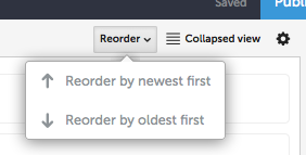
You can click and drag any item up or down and drop it somewhere else in the list - the collapsed view is particularly good for helping with this. You can also automate this by clicking on the Reorder button (shown below, next to the Collapsed view option) and pick which you prefer. I'm a fan of reading the things in the order they were posted so tend to prefer the 'Reorder by oldest first'.

If your Storify contains a conversation happening among more than two people it's possible that tweets sent later will be in response to an earlier tweet - you can manually move these up or down to maintain the threads.

Caution: if you have added a text box during editing Storify will treat is as a recent item and reordering will move it away from the tweets or section that you originally placed it in. I recommend doing any reordering first, then adding in supplementary text.

5. Using the Embed link / Embed URL icon
This is a really useful option and I think it of it as a sort of override button when all else fails. You will find when searching Storify for tweets that many won't appear. This is because the search on Storify doesn't go as far back in time as Twitter.

This doesn't matter because you can find the tweet on Twitter.com (desktop is best for searching), then copy its URL over to the Storify. Every tweet has a timestamp and its URL can be found by hovering over that and copying the link (right click / copy link location).

Similarly every Facebook post has its own timestamp from which you can collect the link (you'll only be able to use it though if the post is set to be public) and every Instagram picture has its own link too. These links can be pasted into the embed URL search bar and the 'item' should appear for you to drag into the appropriate place on the story.


6. Setting the main image icon
By default Storify will use whatever image appears at the top of your story, so if someone's tweet has a picture in it and that's at the top of your story that's the one that'll get used.

You can pick a different picture, but you will have to publish the post first to do this.

a) Publish your post
It's the blue button with 'Publish' on it!


b) View your published Storify story
Click on the green 'Published' button that replaces the orange 'Draft' button. That tiny down-arrow will unfurl a menu from which you can select 'View Published Story'.


c) Choose a different image
Hover over any image, or item that contains an embedded image and some options will appear to the right. If you see the third grey icon in the options to the right of the picture (third one below, looks cunningly like a picture) then you can click that to select that particular image as the one that will appear at the top. Were someone, perhaps you, to add the link to your Storify story on Facebook etc then that's the image that will now be associated with it.

  
d) Log out
Once you've finished creating, editing, saving or publishing your story you can log out using the tiny little down arrow to the right of your username.


7. Things to be aware of - a round-up
a) The content (a tweet, the abstract of a blog post) added to Storify will remain there even after it is deleted from the main service.
b) If you add a lot of tweets and decide to reorder them do that bit before adding in any other commentary, otherwise you'll reorder your commentary out of the order you wanted it in
c) Publishing a story is a public act even if you don't tweet out the Storify's link or share it anywhere. Anyone who has previously used Storify themselves may be notified, by email, that one of their tweets etc has been used in your Storify so they may hear about it. If in doubt, keep it as an unpublished draft.